Edible Santa Barbara Wine Label Artwork Contest
—Most Sophisticated—
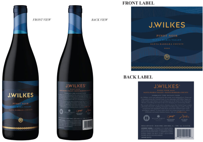
What the Judges Said: This entire label, front to back, is beautifully designed. I love the waves, which are powerful enough to convey movement while remaining subtly in the background, even with the layers of textures within each shape. The metallic lettering rises prominently to the surface, while the smaller type ebbs and flows seamlessly, subtle yet readable. Elegant, evocative of the terroir, deep rich colors reflect the depth and richness of their Pinot Noir.
From the winemaker: “Sourced from the unique sub-AVAs of California’s Central Coast, J. Wilkes offers an extraordinary range of meticulously-crafted wines defined by ocean influence and worthy of exploration.”
Many thanks to our judges: Harriet Eckstein, Jennifer LeMay and Michael Nicola.