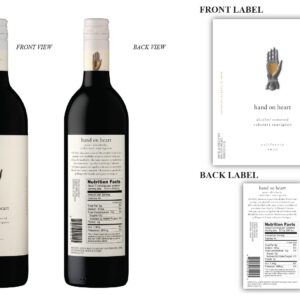
Edible Santa Barbara Wine Label Artwork Contest
—Best Typography—
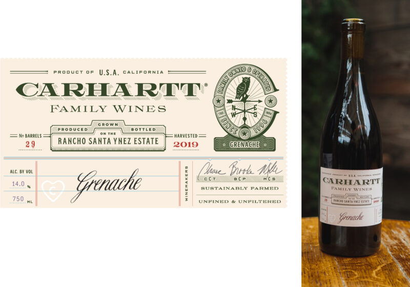
Design by Sebastian Fraye and Megan Kearney.
What the Judges Said: Judges loved this fun, clever label and praised the way it conveyed a lot of information without feeling cluttered. The use of vintage typography gives the design a surprisingly modern flair. One judge said that it conveys a wine made with intention. Indeed. Carhartt says that they carefully place every single detail on the label—from the perforation to the color—to showcase exactly who they are, and what they stand for.
http://www.CarharttFamilyWines.com
Many thanks to our judges: Harriet Eckstein, Jennifer LeMay and Michael Nicola.

